Empowering Your Business with Excellence
Empowering Your Business with Excellence
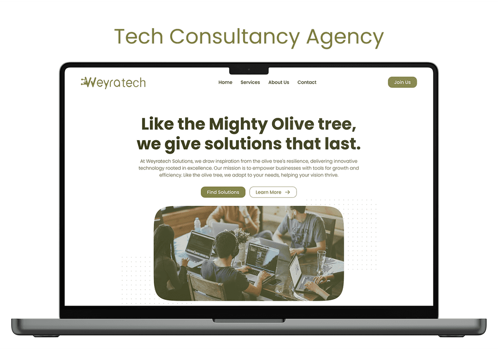
I designed this piece after I was tasked as an entry project for a UI/UX job. Unfortunately, I didn't get the job and I had only 24 hours, so I didn't go through every design process, but I think it turned out great.
I wanted to create a modern-looking, neat design, so I went with a centered layout and rounded shapes all over the design.
The color and the logo were given, so I tinted the pictures to match the color scheme. It gives a really easy feeling that goes well with the minimalistic tone.
The word “Weyra” in Amharic means Olive Tree so it was obvious to go with bold sans serif heading to communicate the strength and the peacefulness of the tree.
I used simplistic card design not to overwhelm the user.
The word “Weyra” in Amharic means Olive Tree so it was obvious to go with bold sans serif heading to communicate the strength and the peacefulness of the tree.
I used simplistic card design not to overwhelm the user.
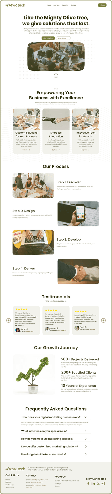
In the About Us page, I maintained consistency with the Home page. The only difference is in the growth journey section, where I divided it into two parts: an image section and a text section. To make the design work effectively, I kept both parts without a background
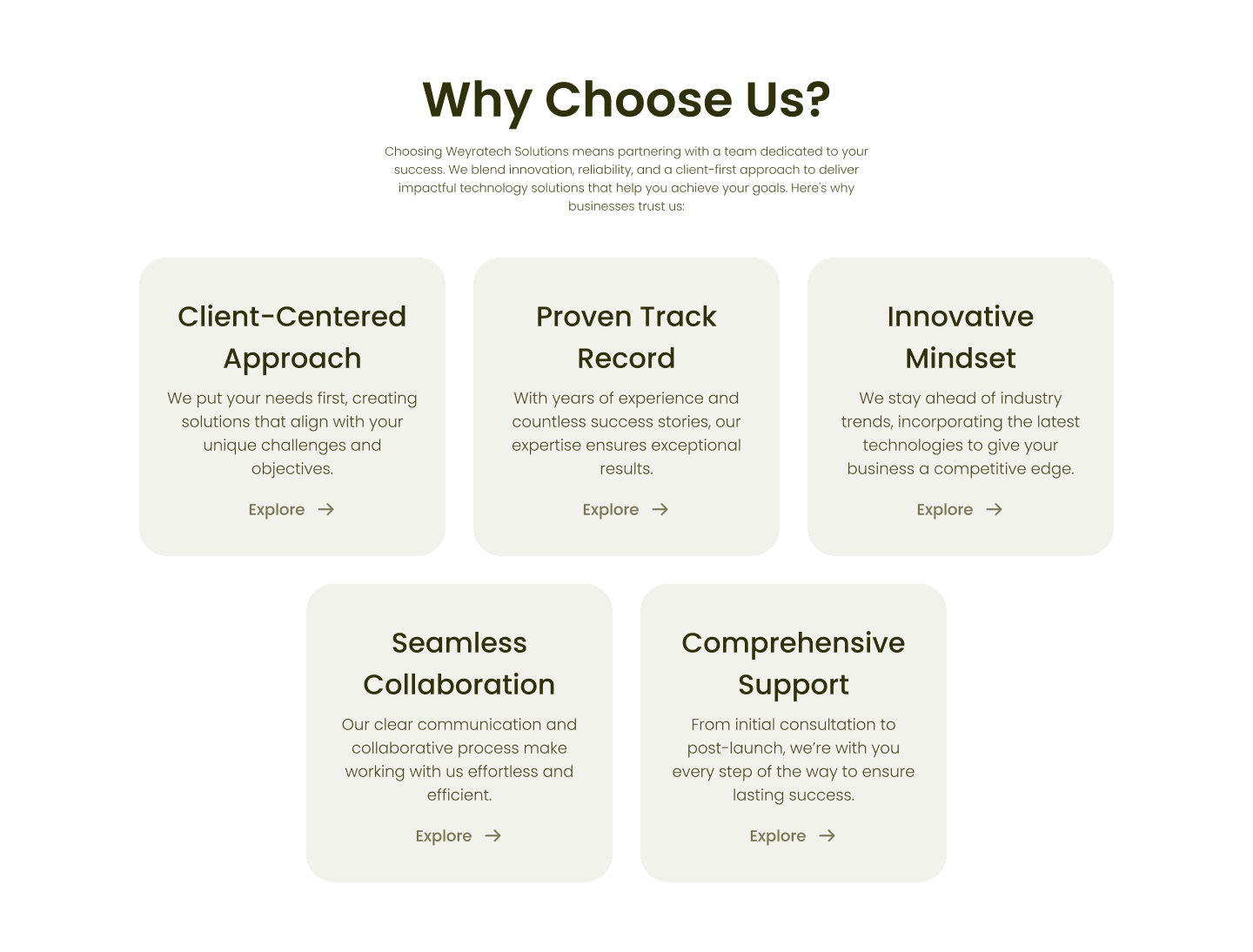
Services page introduced some simplistic Icons with similar tone to give the website aa little bit of depth and to show we can do it gracefully. And In “Why Choose Us?” section I used card designs to make a reader more engaged and not overwhelmed.
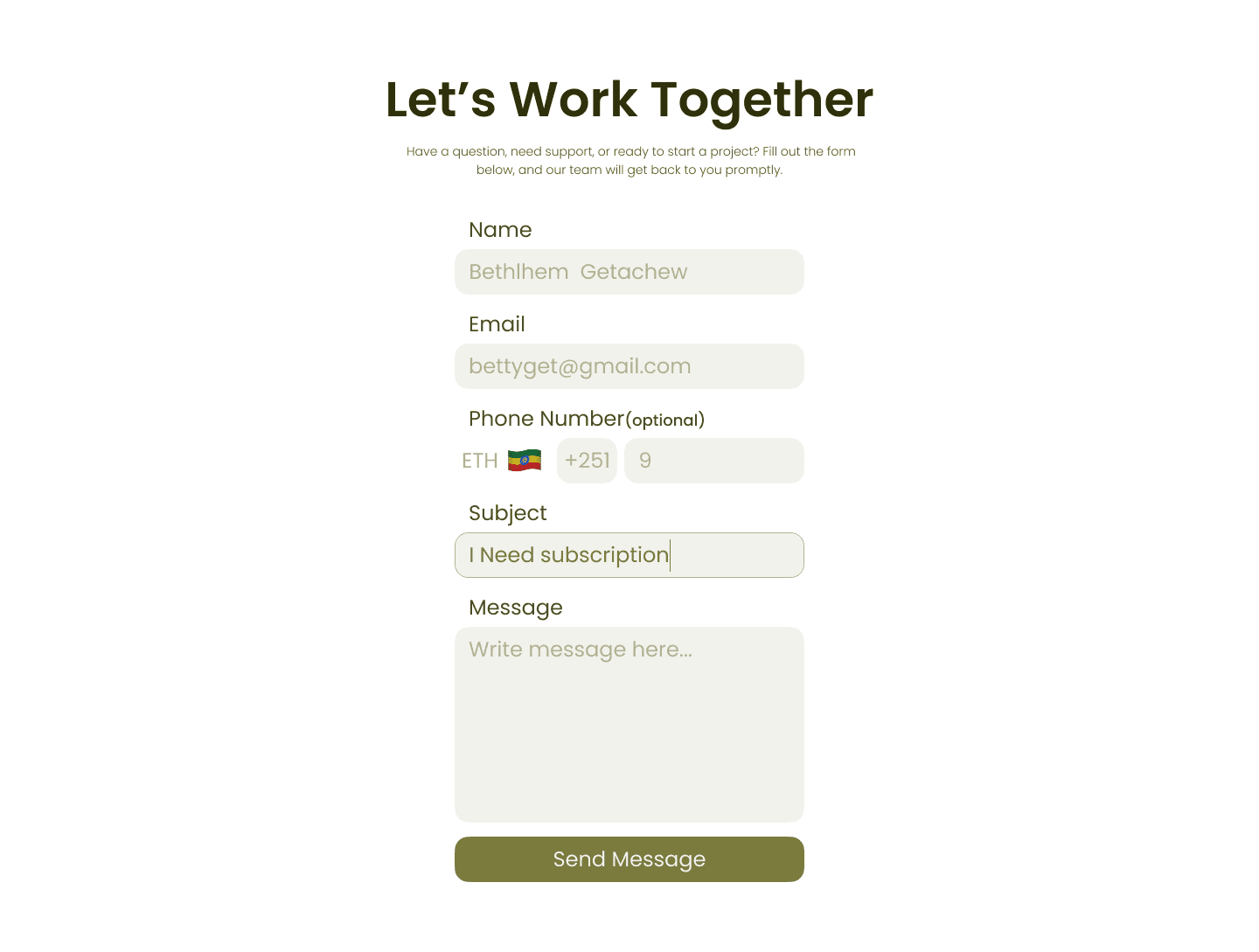
One of the most important page in websites is the sign in login page(information gathering page).
In this design I decided not to go crazy and keep it simplistic and color that matches up the tone.
In the About Us page, I maintained consistency with the Home page. The only difference is in the growth journey section, where I divided it into two parts: an image section and a text section. To make the design work effectively, I kept both parts without a background
Services page introduced some simplistic Icons with similar tone to give the website aa little bit of depth and to show we can do it gracefully. And In “Why Choose Us?” section I used card designs to make a reader more engaged and not overwhelmed.
One of the most important page in websites is the sign in login page(information gathering page).
In this design I decided not to go crazy and keep it simplistic and color that matches up the tone.